Before After Picture
Showcase transformations with smooth, interactive image comparisons and arrow handles.
Overview
Showcase transformations with smooth, interactive image comparisons and arrow handles.
- Three interaction modes (drag, click, or hover)
- Smooth drag interaction with touch support
- Click anywhere to jump divider position
- Hover for automatic follow-cursor interaction
- Circular handle with customizable icons
- Upload one image containing both left and right icons
- Responsive images with srcSet support
- Fully customizable label styling (position, colors, border)
- Adjustable initial divider position
- Optional before/after labels with backdrop blur
- Label position control (top or bottom)
- Works on any layout or screen size
- Hover scale effect on handle
- No coding required
Interactive Before/After Image Comparisons for Framer
Perfect for showcasing transformations, design improvements, or product changes. Drag the circular handle with arrows to reveal before and after images with smooth interactions.
Built for designers who need to demonstrate visual impact effectively.
Features
Three Interaction Modes Choose how users interact with the slider—drag the handle, click anywhere to jump, or hover to follow the cursor automatically. Perfect flexibility for different use cases.
Intuitive Handle Design Circular handle with customizable icons makes the interaction immediately obvious. Upload one image containing both left and right icons, or use the default arrows. Scales up on hover for better user feedback.
Smooth Interactions Works flawlessly with mouse and touch. Responsive dragging with smooth transitions, instant click positioning, or effortless hover tracking.
Full Customization Control every detail—responsive images, custom icons image, labels, divider color and width, handle size, icon sizing, and initial position—all from Framer's properties panel.
Responsive Images Automatically serves the right image size for each device using srcSet support for optimized performance.
Responsive Design Works beautifully at any size. Adapts to desktop, tablet, and mobile with perfect touch support.
Polished Labels Optional before/after labels with full customization—choose position (top or bottom), background color, text color, border styling, and border radius. Includes backdrop blur for a modern look.
Production Ready Optimized performance with smooth animations. Works seamlessly in any Framer layout.
Use Cases
Portfolio Work — Show design transformations and improvements side-by-side
Product Features — Demonstrate before/after results of your product or service
Photo Editing — Showcase retouching, color grading, or editing skills
Renovation Projects — Display home improvements, interior design changes, or remodels
UI/UX Comparisons — Highlight redesigns and interface improvements
Photo Filters — Demonstrate filter effects or image processing
How to Use
Installation
VIDEO PLACEHOLDER: Installation Tutorial
After accessing from FramerHub:
- Log in to your account at framerhub.io
- Navigate to framerhub.io/dashboard
- Find Before After Picture in your Recent Purchases
- Click the "Copy" button
- Open your Framer project
- Paste the component anywhere on your canvas (Cmd/Ctrl + V)
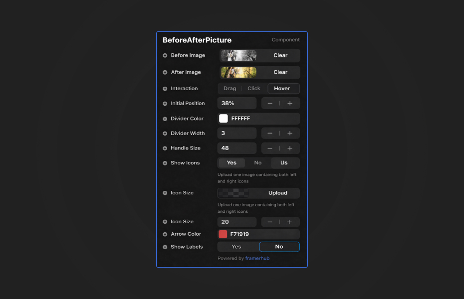
Everything you need is in Framer's properties panel:
Images
- Upload your before and after images (responsive with automatic srcSet)
- Set initial divider position (0-100%)
Interaction
- Choose interaction mode: Drag, Click, or Hover
- Drag mode: Traditional drag-and-drop interaction
- Click mode: Click anywhere to jump divider to that position
- Hover mode: Divider follows cursor automatically
Labels
- Toggle labels on/off
- Customize before and after text
- Choose position (top or bottom)
- Set background color with opacity support
- Customize text color
- Adjust border radius (0-50px)
- Add optional border with custom width and color
Icons
- Toggle icons on/off
- Upload one image containing both left and right icons
- Adjust icon height (12-40px)
- Customize default arrow color if using built-in arrows
Styling
- Adjust divider color to match your design
- Set divider width (1-10px)
- Control handle size (32-72px)
- All labels include backdrop blur for polish
Quick Tips
Image Quality — Use high-resolution images at the same dimensions for best results. Responsive images will automatically optimize for different screen sizes.
Custom Icons — Upload one image that contains both left and right icons side-by-side (like ← →). The component will display the full image. Keep icons simple and recognizable at small sizes.
Color Contrast — Choose divider and icon/arrow colors that stand out against both images for visibility
Initial Position — Set the starting position based on what you want to emphasize (default 50% shows both equally)
Mobile Testing — Always test touch interaction on mobile devices in preview mode
Alignment — Ensure both images have the same subject aligned for smooth comparison
Handle Visibility — Use contrasting colors for the handle to ensure it's immediately visible
Label Styling — Adjust label background opacity for better readability. Use borders to make labels stand out or keep them borderless for a clean look
Interaction Mode — Use Drag for traditional control, Click for quick comparisons, or Hover for presentations and demos where hands-free interaction works best
License
Single Use License — Use in one client project with full commercial rights. No redistribution. 1 license = 1 client.
Refund Policy
Due to the nature of our digital products, we are unable to offer refunds, but we're here to assist you with any questions or concerns!
Why Designers Love This
Three interaction modes give you complete control over user experience. Choose drag for traditional interaction, click for quick comparisons, or hover for demos and presentations. The circular handle with customizable icons makes every mode instantly clear.
Upload your own branded icons image (containing both left and right icons) or use the default arrows. Smooth interactions with hover effects feel premium and polished across all modes.
Responsive images ensure optimal performance across all devices. Simple setup with full control over interactions, icons, colors, and sizing. Perfect for portfolios, case studies, and landing pages where you need to show tangible results or transformations.
Need Help? Visit framerhub.io/support for documentation and video tutorials.
Before After Picture - $12
Showcase transformations with smooth, interactive image comparisons and arrow handles.
You might also like
Why Choose Framer Hub Components
Loved by Framer teams
Used by Framer professionals who need premium, no-code experiences.
"The Best Framer CMS Filtering Plugin I've Found — Truly a Game-Changer. I've tested a lot of Framer CMS filtering and sorting components — both free and paid — and this is by far the best one I've come across."
"He really helped me out when I needed assistance adding it to my Framer project. Super fast customer support highly recommend!"
"We had tried a couple of other Framer CMS filter components but they were buggy, hard to use and support was slow or non-existent. FramerCMSFilter is easier to use and has a lot of added functionality."
Got questions? We've the answers
Got questions? We've the answers
Everything you need to know about FramerHub.