10 Framer Design Trends Dominating 2026 (With Code Examples)
 Shahul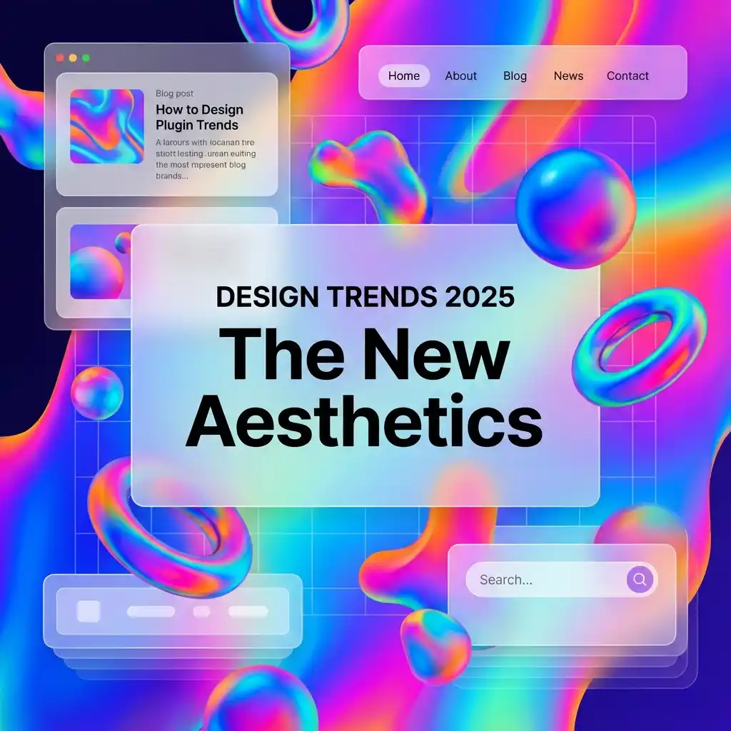
Framer design trends evolve fast, and 2026's landscape has shifted further from 2025's already-more-interactive baseline.
What worked in 2024 (minimal, flat design) gave way to richer, more dimensional experiences in 2025 — and 2026 has pushed that further, with AI tools moving from a novelty add-on into an actual part of the design workflow.
If you're a Framer freelancer or agency, staying ahead of these trends isn't optional — it's how you justify premium rates and win pitches against competitors still shipping 2022-era layouts.
Here's the full breakdown of the 10 Framer design trends dominating 2026, with real implementation tips and code you can use immediately.
1. 3D and WebGL Effects (The New Hero Standard)
What it is: Three-dimensional elements and WebGL animations replacing flat hero sections as the default for premium sites.
Why it's trending: Tools like Spline and Three.js make embedding real 3D graphics into a Framer site accessible without being a dedicated 3D artist — export a scene, drop it in as an embed, and it just works.
How to implement:
- Use Spline to design a 3D scene, export as an embed, and drop it directly into Framer.
- Or use pre-built 3D components (interactive product viewers, particle fields) available in component marketplaces.
- Keep the 3D asset itself under a reasonable file-size budget — a beautiful hero scene that adds 3 seconds to LCP defeats its own purpose.
Note: 3D effects can be heavy on page weight. Make sure to
Best for: SaaS landing pages, creative portfolios, tech startups.
2. Bento Grid Layouts (Apple-Inspired Modularity)
What it is: Asymmetric, card-based layouts where each "tile" holds a single feature, image, or stat — popularized by Apple's product pages and now standard across SaaS marketing sites.
Why it's trending: Bento grids are highly scannable and feel inherently modern; they also make it easy to show 5-8 distinct pieces of information without a wall of text.
How to implement:
- Use Framer's native Grid or Flexbox layout — no code components required.
- Mix large and small cards (2x2, 1x1, 2x1) to create visual rhythm instead of a uniform grid.
- Add subtle hover effects (scale, border glow) to each card for interactivity.
Best for: Feature sections, portfolios, SaaS product pages.
3. Glassmorphism 2.0 (Frosted Glass, Refined)
What it is: The frosted-glass effect, refined with better contrast and accessibility than the original 2020-era wave of glassmorphism.
Why it's trending: It adds visual depth without overwhelming the content underneath, and it works cleanly in both light and dark modes when contrast is handled correctly.
CSS reference:
background: rgba(255, 255, 255, 0.1);
backdrop-filter: blur(10px);
border: 1px solid rgba(255, 255, 255, 0.2);
How to implement in Framer:
- Create a frame with a semi-transparent background fill.
- Add a Backdrop Blur effect from Framer's effects panel.
- Add a subtle 1px border for definition against busy backgrounds.
- Test contrast against both light and dark background images — this is where the original glassmorphism trend often failed accessibility checks.
Best for: Navigation bars, cards, pricing tables.
4. Micro-Interactions Everywhere
What it is: Small, deliberate animations that respond directly to user actions — button hover, scroll position, clicks, form focus.
Why it's trending: They make a site feel alive and responsive, and they measurably increase perceived quality even when the underlying content is unchanged.
Examples:
- Buttons scale slightly (1.02-1.05x) on hover.
- Icons animate in when they scroll into view.
- Form inputs glow or shift border color when focused.
How to implement:
- Use Framer's Hover and Tap variants for click/touch feedback.
- Add Scroll Transform effects to trigger animations as elements enter the viewport.
- Keep durations subtle — 0.2-0.3s is the sweet spot; longer feels sluggish, shorter can feel jarring.
Best for: CTAs, navigation menus, interactive dashboards.
5. AI-Generated Gradients and Backgrounds
What it is: Complex, AI-generated gradient patterns replacing flat solid-color backgrounds.
Why it's trending: Tools like Midjourney can generate unique, organic gradient textures that feel more distinctive than a standard two-stop CSS gradient.
How to implement:
- Generate a gradient/texture pattern in an AI image tool.
- Export as a compressed image (WebP, ideally under 300KB).
- Set as a section background with reduced opacity or a blend mode layered underneath your actual content.
Best for: Hero sections, section dividers, testimonial backgrounds.
6. Dark Mode as the Default
What it is: Designing for dark mode first, then adapting down to light mode, rather than the reverse.
Why it's trending: Developer- and technical-audience segments have consistently preferred dark mode for years, and it reduces eye strain during extended sessions.
How to implement in Framer:
- Use Framer's built-in Dark Mode feature.
- Define color variables for both modes so switching is a value swap, not a manual redesign.
- Test your entire site in dark mode first, then verify light mode — building dark-first surfaces contrast issues you'd otherwise miss.
Best for: Developer tools, SaaS apps, content-heavy technical sites. For consumer or brand-forward sites, test both — dark-first isn't universally the safer default outside technical audiences.
7. Typography as the Hero Element
What it is: Oversized, bold typography (100px+) carrying the entire hero section as the primary visual element, with minimal supporting imagery.
Why it's trending: It loads fast (text is cheap compared to images or 3D scenes), it's inherently accessible, and it makes a confident visual statement without relying on stock photography.
Best practices:
- Use variable fonts for smooth weight transitions across breakpoints.
- Pair bold headings with minimal supporting body text — let the typography carry the visual weight.
- Add subtle entrance animations (letter-spacing shifts, staggered fade-ins) without overdoing it.
Best for: Agency sites, portfolios, brand-focused landing pages.
8. Scroll-Linked Animations (Parallax 2.0)
What it is: Animations tied directly to scroll position, not just scroll speed or a simple fade trigger — creating a genuine sense of depth as the user scrolls.
Why it's trending: It makes long-form pages feel interactive and directional instead of static, which is especially valuable for storytelling-heavy case study or product pages.
How to implement in Framer:
- Use Scroll Transform on individual frames.
- Tie Y position, scale, or opacity to scroll progress rather than a fixed trigger point.
- Stagger multiple elements' transforms slightly for a layered, dimensional effect instead of everything moving in lockstep.
Best for: Storytelling pages, product showcases, case studies.
9. Component-Based Design Systems
What it is: Building entire sites from reusable, modular components instead of one-off page layouts assembled from scratch each time.
Why it's trending: Agencies need scalable systems for client handoffs at volume, and freelancers need speed to stay competitive on price without cutting quality.
How to implement:
- Create Master Components for buttons, cards, and section templates.
- Use Framer Variants for different states (Primary/Secondary, Light/Dark, Default/Active).
- Store components logically in the Assets Panel, grouped by type, for fast reuse across projects.
For the full architecture behind this — naming conventions, CMS relationships, handoff workflows — see our guide on
Best for: Agencies, multi-page sites, template sellers shipping multiple products.
10. AI as a Practical Design Workflow Tool
What it is: AI tools moving beyond generating one-off images into an actual part of the layout and content-structuring workflow — suggesting section orders, generating placeholder copy variants, or flagging accessibility issues in a draft layout.
Why it's trending: This is the clearest shift from 2025 to 2026 — AI assistance has moved from novelty backgrounds toward genuinely useful drafting and review help inside the design process itself.
How to use it practically:
- Ask an AI assistant to suggest a hero layout structure for a specific audience (e.g., "SaaS landing page for a project-management tool"), then build the winning structure in Framer with your own branding and content.
- Use AI to generate several headline/subhead variants quickly for A/B testing, rather than staring at a blank page.
- Have an AI tool review a finished layout for obvious accessibility gaps (contrast, missing alt text patterns) before final handoff.
Best for: Rapid prototyping, client pitches, A/B testing headline variants.
Bonus: SEO- and AI-Search-First Design
What it is: Designing with both traditional search engines and AI answer engines (ChatGPT, Perplexity) in mind from the very first page structure decision, not retrofitted after launch.
Why it's trending: Sites that aren't discoverable by AI search are increasingly invisible to a growing share of how people find products and information in 2026.
How to implement:
- Add JSON-LD schema to CMS-driven pages (blog posts, products, FAQs).
- Use genuine semantic HTML —
<h1>,<h2>,<nav>,<footer>— not a page built entirely from unlabeled<div>layers. - Add
llms.txtfor AI discovery alongside your standardrobots.txt.
(See our full guide:
Trend Adoption at a Glance
| Trend | Build effort | Performance risk | Best-fit site type |
|---|---|---|---|
| 3D/WebGL hero | High | High if unoptimized | SaaS, portfolios, tech startups |
| Bento grids | Low | Low | Feature sections, SaaS |
| Glassmorphism 2.0 | Low | Low | Nav bars, cards, pricing |
| Micro-interactions | Low-Medium | Low | Almost any site |
| AI-generated backgrounds | Low | Medium (image weight) | Hero sections, dividers |
| Dark mode default | Medium | Low | Dev tools, SaaS |
| Oversized typography | Low | Low | Agency, portfolio, brand sites |
| Scroll-linked animation | Medium | Medium | Storytelling, case studies |
| Component systems | Medium (upfront) | Low | Agencies, multi-page sites |
| AI workflow tools | Low | None (workflow, not runtime) | Any team drafting layouts |
Use this table to prioritize: if you're on a tight timeline, bento grids, micro-interactions, and typography-led heroes deliver the most visual impact for the least build and performance risk.
What Changed Since 2025
A few honest notes on what's held up and what's shifted since this list was first written:
- 3D/WebGL hero sections have gone from "cutting edge" to genuinely mainstream on SaaS and startup sites — the risk now isn't standing out, it's blending in with everyone else who adopted it too.
- AI-generated backgrounds are more common but also more scrutinized — audiences have gotten better at spotting generic AI-gradient patterns, so distinctive execution matters more than it did in 2025.
- Component-based systems have shifted from "agency best practice" to close to a baseline expectation — clients increasingly ask directly whether a build uses a real component system before signing off on a proposal.
- AI as a workflow tool (trend #10) is the newest addition to this list — in 2025 AI's role in Framer design was mostly generative backgrounds and layout inspiration; by 2026 it's become a genuine part of the drafting and review process itself.
Trends that didn't make this year's list but were notable in 2025 — heavy skeuomorphism and maximalist color-blocking — have cooled significantly in favor of the more refined, restrained aesthetic reflected in the ten trends above.
Conclusion: Stay Ahead of Framer Design Trends
The Framer design trends of 2026 are defined by interactivity, dimensional depth, and AI woven into the actual workflow rather than bolted on as a gimmick.
If you're still shipping sites that look like 2022 — flat, static, no motion — you're leaving money on the table against competitors who've adopted even two or three of the trends above.
Action steps:
- Pick 2-3 trends from this list that fit your next project's audience and timeline.
- Implement them deliberately, checking performance impact as you go rather than after launch.
- Show before/after examples to clients, and price the upgrade accordingly.
Want components that already follow these trends?
Shahul
Founder of FramerHub